
Austerlitz is the 4th exploration of the world of Didots and their variants, following Ambroise (2001-16), Mencken Head (2004-16), AW Conqueror Didot (2010-18) published by Typofonderie. Austerlitz is an exception though, in that it is not a pure Didot, it is a versatile typeface in 7 weights with italics, in 4 optical sizes for a total of 56 fonts.
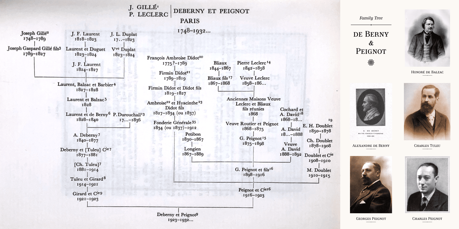
Genealogy of the Deberny & Peignot foundry from the point of view of the de Berny branch.
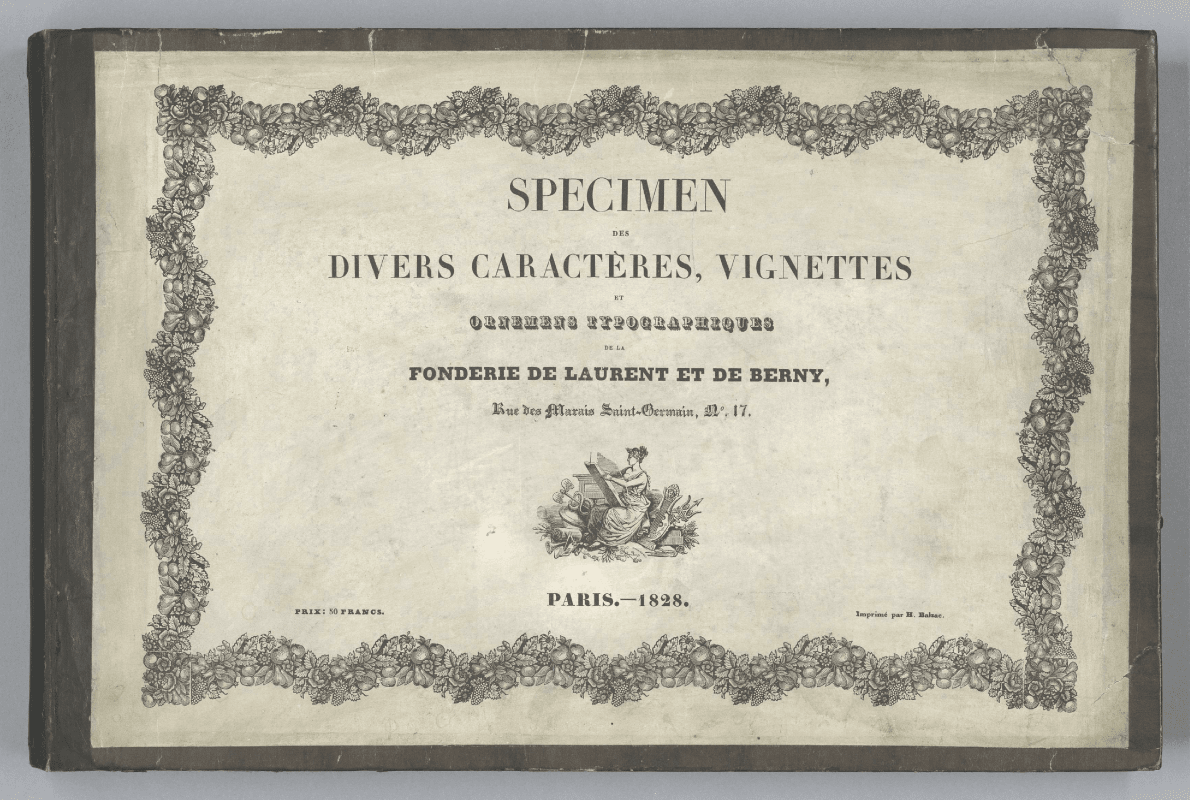
Spécimen des divers caractères, vignettes de la fonderie de Laurent de Berny.
Austerlitz and its context
Austerlitz (2014-2022) is a typeface loosely inspired by Série 16 (circa 1878) ¶1 published after the departure of d’Alexandre de Berny 1809-1881, ¶2 by Deberny & cie. From 1877 onwards, Charles Tuleu, 1849-1934 runs the business. In 1970, explaining this transmission of the business, Charles Peignot stated that Charles Tuleu was the natural son of Alexandre de Berny.
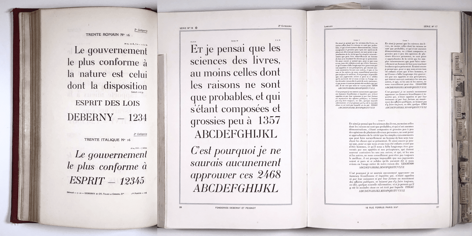
Série 16, Livret Typographique, Deberny & cie.
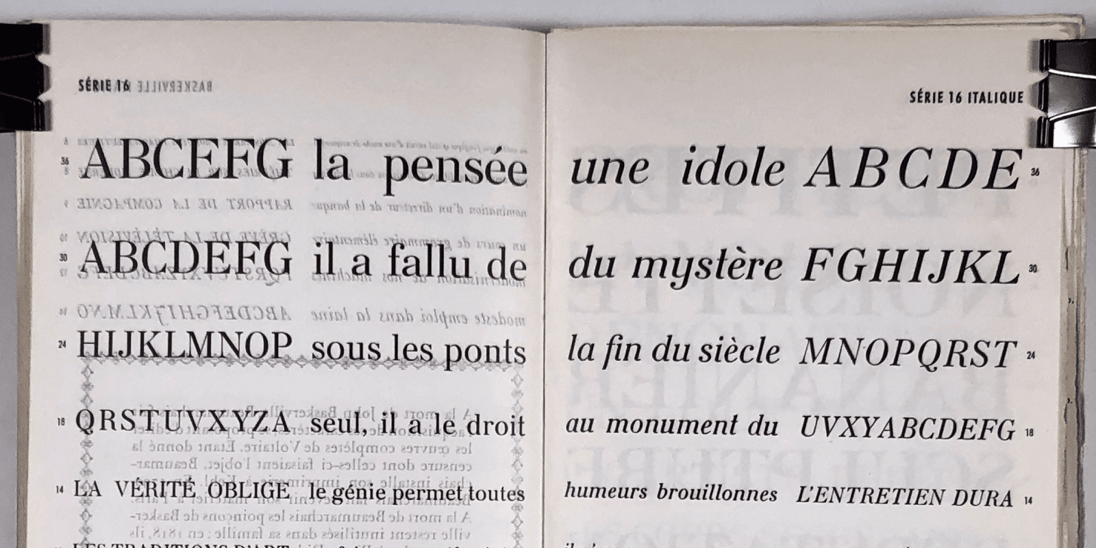
Série 16, featuring an alternate g on the left page, Livret Typographique Deberny & cie Tuleu Girard Successeurs and catalogue général Deberny & Peignot.
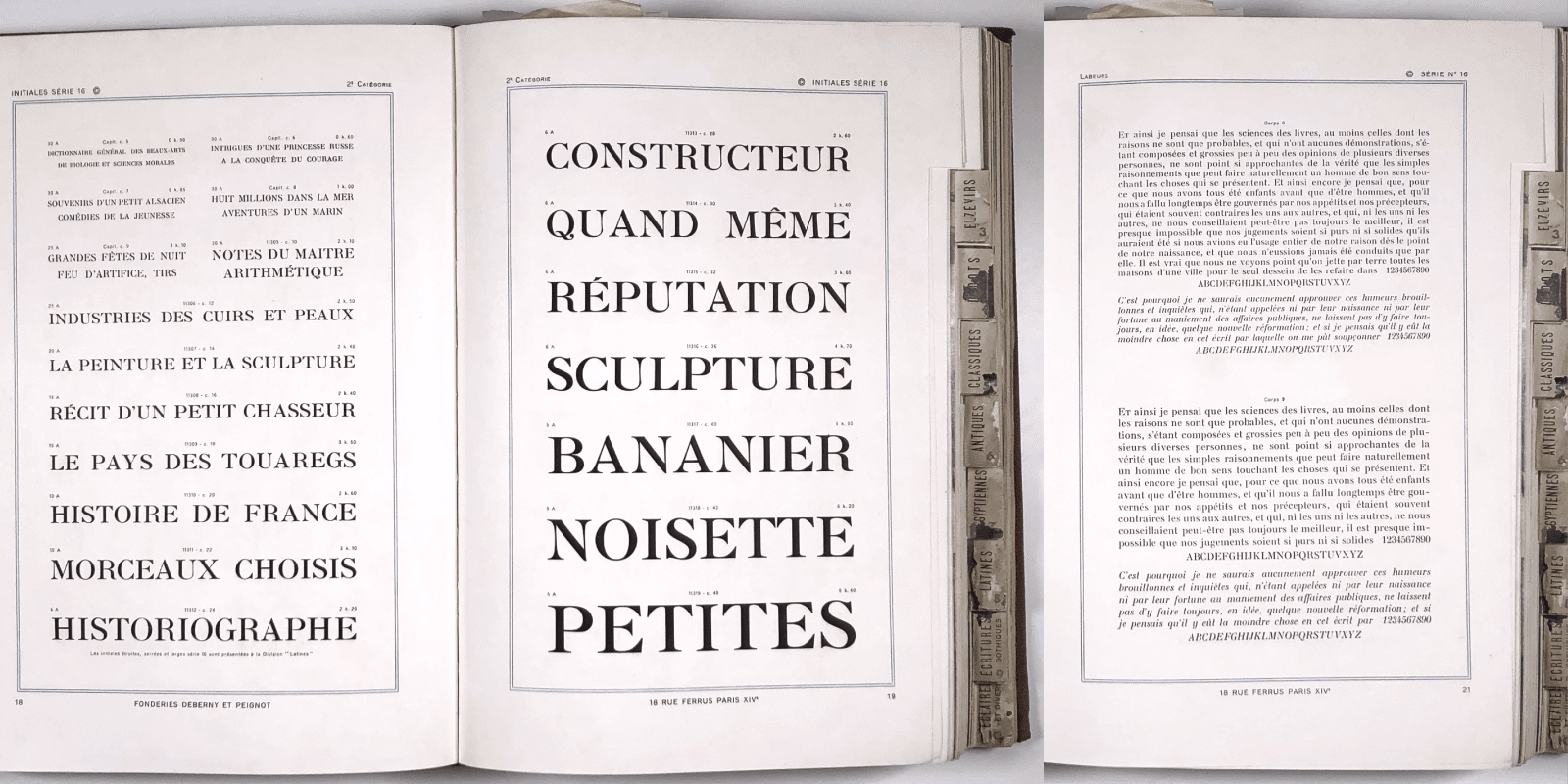
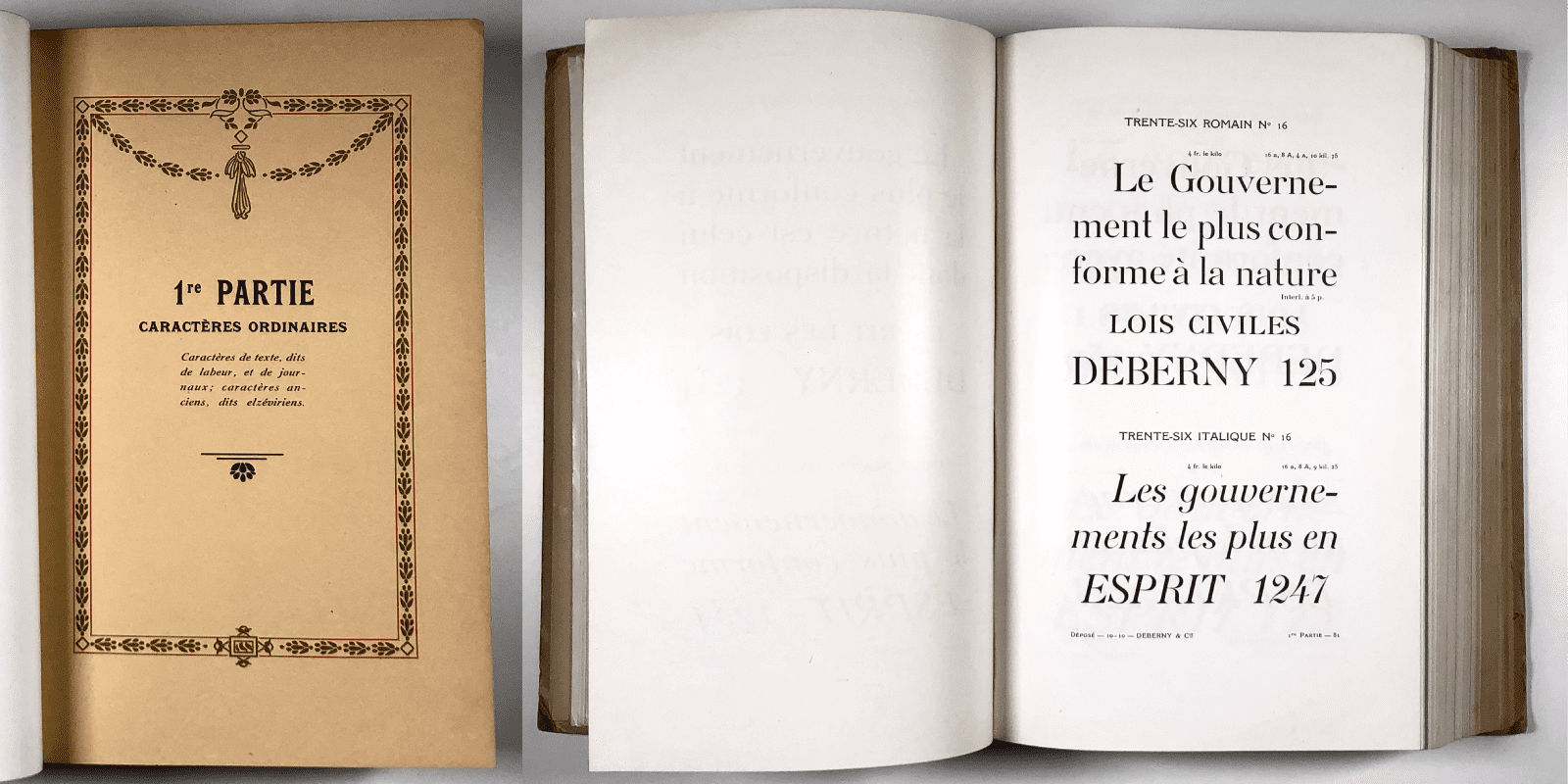
Série 16, initiales and small sizes, general catalogue Deberny & Peignot.
Série 16, large sizes, general catalogue Deberny & Peignot.
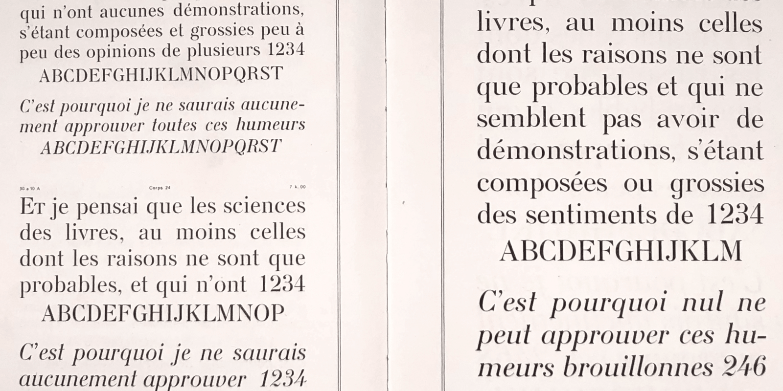
Série 16, small specimen Deberny & Peignot.
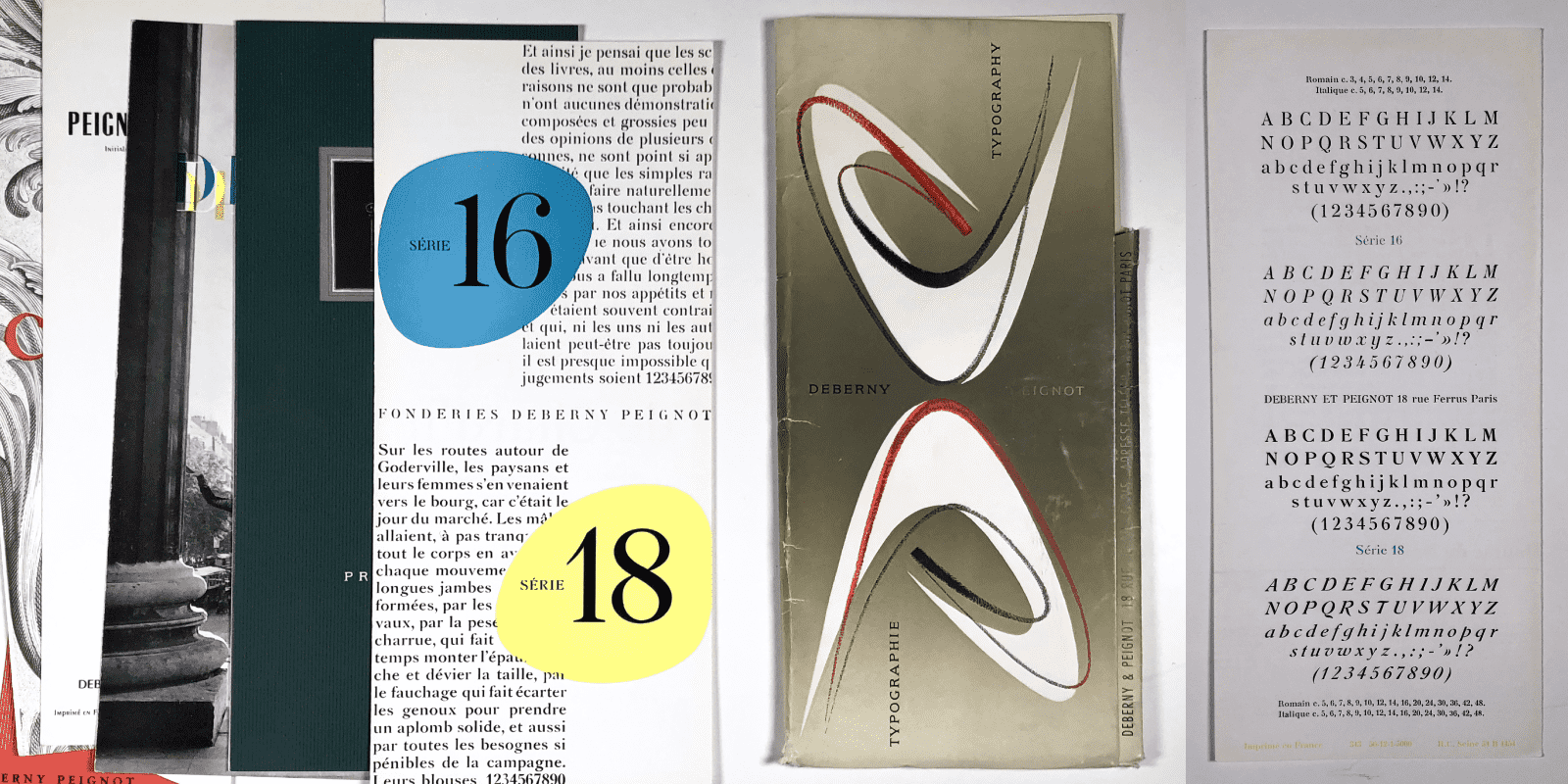
Séries 16 and Séries 18, collection of specimens in a folder. Deberny & Peignot.
In Livrets typographiques (the name of the typeface catalogue published by this foundry) Deberny & cie, the “labeur” (body text) typefaces are identified by a serial number. Série 16 will remain one of the “caractères ordinaires modernes” (ordinary modern typefaces) intended for typographic composition at Deberny & Peignot until its closure in 1974. ¶3 This new typeface, cut by the Auberts (Constant, his son, and his brother Auguste) resembles a Didot, but it does not follow the characteristics of this style: the counterforms are smoothly rounded – in a Didot they are usually straight in contrast –, the stress is not completely vertical, there are traces of written letterforms. In addition, the serifs are bracketed and the italics are an innovation for their time.
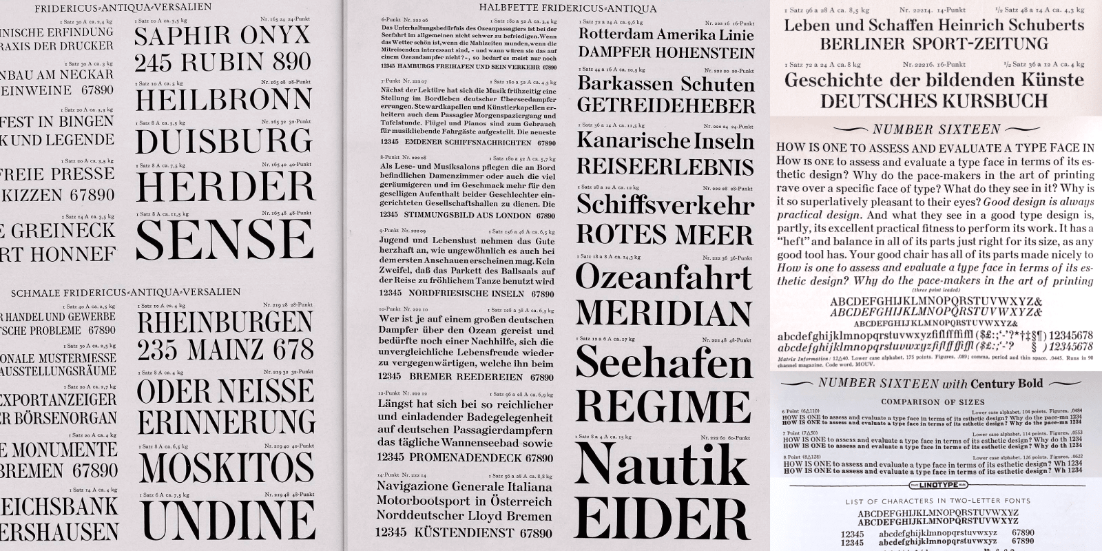
Fridericus, Genzsch & Heyse and Linotype Number sixteen proposed as duplexing matrices with Century Bold.
It is interesting to note that the Série 16 was rapidly distributed by Genzsch & Heyse under the name Französische Antiqua (1891), then by Fridericus (1923), ¶4 with additional weights; by Monotype under the name French Round Face (1906); by Linotype as Number 16 (1910) ¶5 which adapts it to duplex matrices. When Jan Tschichold worked for UherType, he designed several typefaces that were never used or completed: Série 16 (1934) is one of them. ¶6 These adaptations of the Série 16 in various countries would tend to suggest a form of universal multi-cultural acceptance of its expressions.
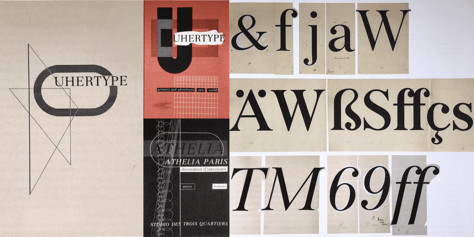
Drawing of the adaptation of Série 16 by Jan Tschichold for UherType and some promotional documents set in Série 16 UherType.
More recently, I can’t help but see in the sublime family of Chronicle (2002) ¶7 the influence of Série 16, probably via Linotype Number 16? For Jonathan Hoefler, I think it is above all a starting point that allows him to develop a more local narrative, linked to the history of American typography.Let’s not forget either Charles Mazé’s Berthe (2018) which clearly asserts its Série 16 origin. ¶8
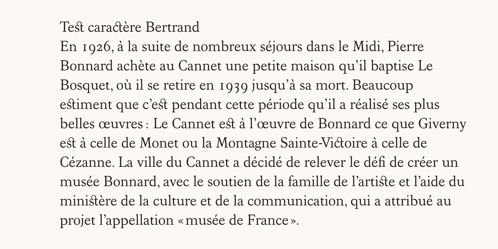
Revival of a typeface from the Bertrand Foundry (2003). Typeface design course, École nationale des arts décoratifs (ENSAD), Paris.
The idea of a rather common typeface
In 2003, while teaching type design at the École nationale des arts décoratifs (ENSAD) (1997-2004), the Bertrand foundry caught my attention as I was researching a French historical reference. During an entire semester, a typeface from this foundry was used as the basis to draw a revival in the class. The result of this collective student project was a default typeface, that seemed quite unremarkable in print, somewhat like Imprint, Times or Georgia.
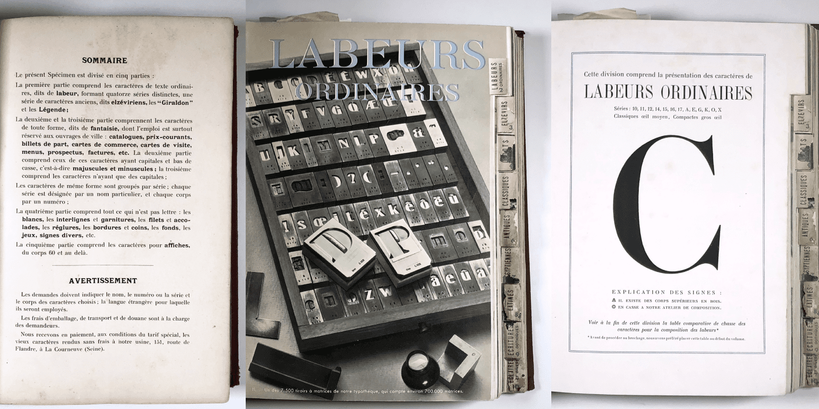
Excerpts from the Deberny & cie and Deberny & Peignot catalogues, classifying the typefaces according to use or style. Série 16 is one of the 14 series of ordinary text typefaces, known as labeur (body text) typefaces.
The characteristics of Austerlitz
Charles E. Osgood in his book The Measurement of Meaning, ¶9 proposes 12 adjectives as semantic differentiators: elegant, classical, kitsch, dynamic, austere, current, natural, heavy, virile, harmonious, ornamental, technical. This vocabulary makes it easy to describe typefaces, even if these words have different meanings for different people.
Using these adjectives, Austerlitz is a serif typeface classified as: common, natural, harmonious for the Petit and Labeur variants. Then elegant, classic, ornamental for the Gros and Affiche variants.
In text use, Austerlitz roman versions of the Petit and Labeur variants conform to this idea of an unassuming, everyday typeface. It delivers the content with ease, it does not impose itself between the text and the reader, it is sober and knows how to be forgotten.
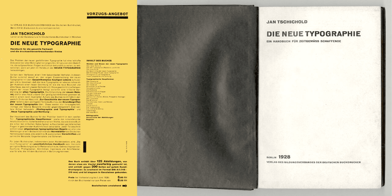
Die Neue Typographie, Jan Tschichold, 1928.
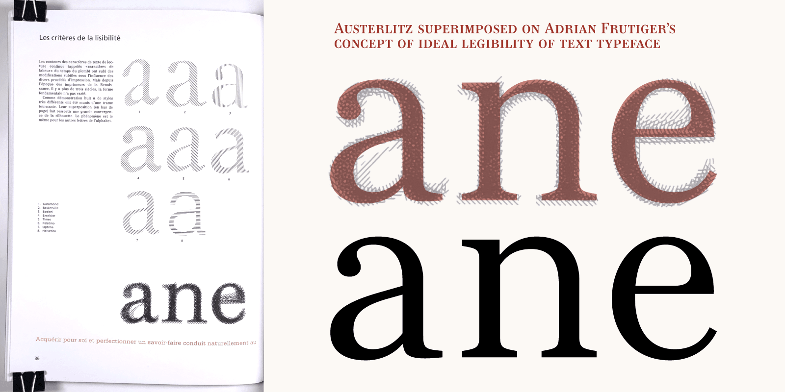
Adrian Frutiger conceptualized an ideal form, more readable than others because it comes from the synthesis of an ideal serif typeface classics. This comparison of Austerlitz with Adrian Frutiger’s synthesis reaffirms the universality of Série 16. Adrian Frutiger, when he was the art director of the Deberny & Peignot foundry, was inevitably involved in this “labeur ordinaire” typeface.
In Caractères Ordinaires ¶10 by Aurélien Vret, associate researcher at Bibliothèque nationale de France, he explains that some of the “Caractères Ordinaires” initiated by Laurent & Deberny were lent to Émile Javal for his research (circa 1878-81). In 1878, the latter set out a series of “hygienic” measures, including preferences for certain typefaces, to be used to combat myopia and thus improve the legibility of texts. The Série 16 and the variant 17 (with its extended descenders) is the result of his physiological theories, collected in his book Physiologie de la lecture et de l’écriture published in 1905.
Seen through our 21st century eyes, associating it with a canon of typography or a specific period is not easy, other than labeling it as a serif typeface. In his youth, Jan Tschichold in Die Neue Typographie ¶11 defined the characteristics of serif typefaces that would not reference any historical period: a typeface like Austerlitz (in its Petit and Labeur versions) makes itself discreet, like a man who walks into a room, a shop or a museum and that nobody notices. In fact, this type of design is what Adrian Frutiger was looking for when he superimposed different typefaces: “The superimposition of eight serif typefaces brought out a great convergence of the silhouette.” ¶12
In Gros and Affiche versions, Austerlitz tells a different story. Its shapes and contrasts, its elegance, reference a late Didot, in its most beautiful ceremonial dress. With a strong contrast, the classic typographical forms make a strong statement on the page (paper or screen).
The role of italics has been discussed for over a century. What italic letterform design will best serve the text? I often tell my students that a good italic should contain at least two of five ingredients to make it work: slope, weight contrast, width contrast, change of design, serifs.
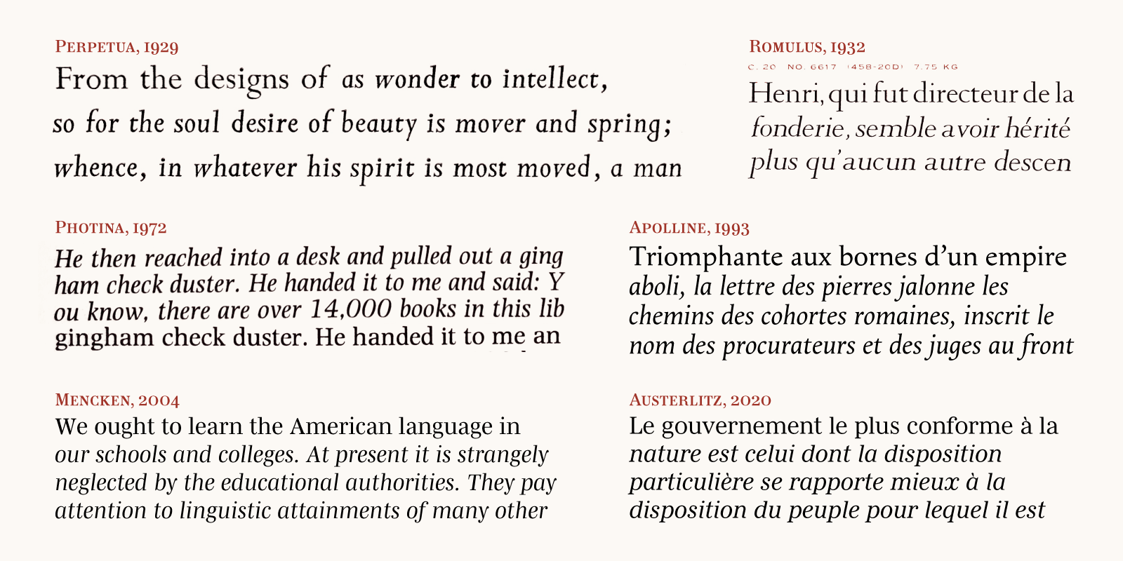
The Austerlitz italics follow 40 years ahead of Stanley Morison’s ideas, or is it the other way around!? In Fleuron 5 (1926), Stanley Morison ¶13 publishes Towards an Ideal italic, an article in which he defends the idea that an italic is at the service of the roman, that it should not be too cursive, and should take the serifs of the roman. Eric Gill almost took this route with his Perpetua Italic (1929) — engraved by the Frenchman Charles Malin — even if it was already more flexible; in contras, Jan Van Krimpen drew a slanted roman for his Romulus... (1932). ¶14 Much later, José Mendoza attempted in turn to follow this idea of italics for his Photina (1972), and more recently, Jeremy Tankard for his Kingfisher (2004). ¶15 I myself have applied this concept of integrated italics to the Roman with my Apolline (1993), then with Mencken (2004).
In reality, the Austerlitz italics — inspired by the 16 Séries — goes further. Because the weight is similar to the Roman, the differences in text colour are more subtle, without losing the italic function. Were Stanley Morison’s writings influenced by Série 16, seen at Deberny & Peignot during his frequent trips to Paris?
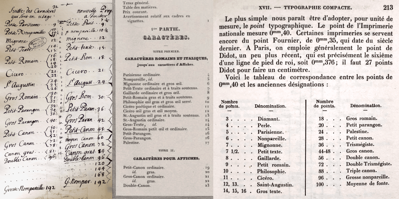
Excerpts from the notes of the Gaugeon Commission, in charge of Romain du Roi drawings. Excerpts from the summary of the “Spécimen des divers caractères, vignettes de la fonderie de Laurent de Berny”. Reference concerning the typographical point system and old names in the “Physiologie de la lecture et de l’écriture”, Émile Javal, 1905.
A few words about the names Austerlitz, Petit, Labeur, Gros, Affiche
Our intention was to reference the names given to type sizes before the typographical point system was introduced by P. S. Fournier, then reinforced by the Didot family. Keep in mind that with the arrival of photocomposition, a single drawing was potentially used for all sizes. In the 1960s and 1970s, 14 pt and 16 pt type were used as models for their photographic adaptation. This was the result of a compromise: it was acceptable for text composition but less than adequate for titling.
This put us in the conflicting position of recommending a specific size for a specific use, while promoting the easy availability of all sizes in our digital world. When the sublime ITC Bodoni was released in 1993, it was available in ITC Bodoni 6pt, ITC Bodoni 12pt, ITC Bodoni 72pt versions, as if to better indicate that certain versions were more suitable for certain point sizes. Today, in function of the particular medium, the desired contrast or the designer’s choices, it is difficult to impose a design for a particular size. It is more a question of explaining the possibilities. With PS Fournier, 3 versions were available: the Basic version, the Small version, the Large version. ¶16 We adopted the same principle with Austerlitz: Petit will be dedicated to very small sizes, Labeur to intermediate sizes. In French, the term “Labeur” refers to the so-called “labeur” printers who specialize in printing books. But nothing would prevent one from using these two versions in large sizes to continue promoting this idea of the ordinary and the simple, the typeface that knows “how not to be seen”! The Gros version is more adapted to large sizes and the Affiche version is more suitable for use in very large sizes. Finally, the four names follow an alphabetical order, to be more consistent with the listing order.
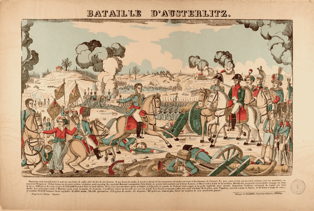
La Bataille d’Austerlitz, engraving by François Georgin (1801-1863).
The name of a typeface family meets several criteria. The name Austerlitz is a choice in reference to the French 19th century. Since 1989, I have (almost) consistently given names starting with the letter A, a constraint that limits the possibilities. Furthermore, the shape of the word ideally highlights the most significant glyphs that are specific to its design. The name Austerlitz is like a trademark, it is the first use of the typeface that will be seen. The cultural or historical reference adds to the story we are trying to tell. Austerlitz refers to the battle ¶17 fought by Napoleon 1st on December 2, 1805. This battle is legendary because the French set out with half as many men as their adversary. Napoleon’s strategy was based on a manoeuvre that deceived the enemies into thinking they had the advantage. The typographical analogy is that Austerlitz is a humble typeface, revealing its assets only once it falls into the hands of a talented designer. It will be up to this designer to enhance it in his projects.
The vignettes and borders of Austerlitz
Like a meal without cheese or dessert, it’s brutal to imagine publishing a typeface without adding ornaments and borders! With Ambroise (2001) we started designing sets of vignettes and borders adapted to every weights and width. A small palette of elements combined in different variations of weight and width offer a fantastic playground for users. Since then, this search for “variable” ornaments and dingbats has never stopped. With Austerlitz, we set out to design a very reduced set of vignettes in weights and contrasts, adaptable and combinable. It is fairly easy to draw a bolder or a more contrasted version of a typeface, whereas doing the same thing with an ornament is sometimes a real challenge. We have included arrows, and their combinable versions, as well as three vignettes, and a set of tools to create blocks and borders, all in 56 variants.
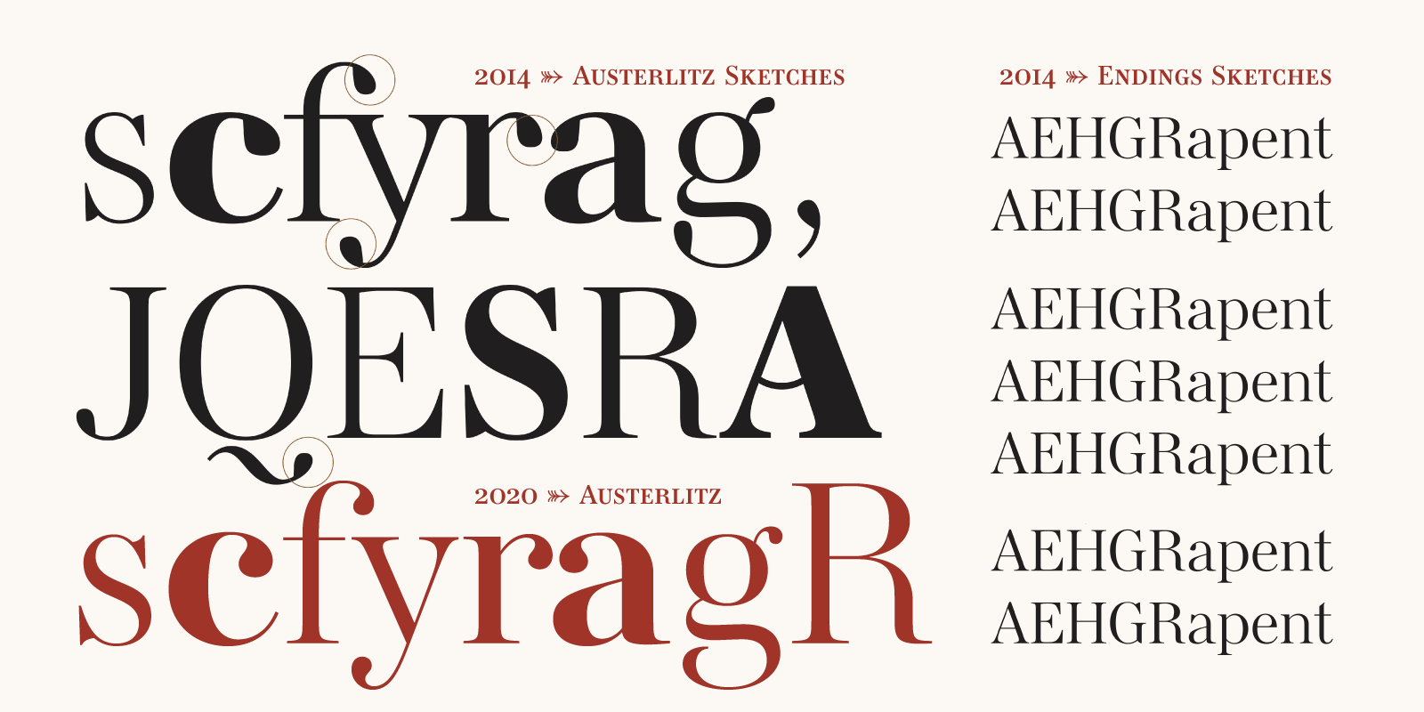
First sketches for a typeface in 2014, that would ultimately become Austerlitz.
Acknowledgements
In July 2014 with my drawings of various weights of the romans, then optical and italic variants, Austerlitz was born. But it is in 2018 that the project will develop over a period of 2 years. I would like to thank, in order of appearance, the contributors: Joachim Vu, Benjamin Blaess, Pauline Fourest, Fanny Hamelin, Morgane Pambrun, without forgetting 4 interns who have helped us over the years. Auterlitz finally published in 2022, is a project that the Typofonderie team ¶18 can be proud of.
— Jean François Porchez
Notes
¶1 Séries n°16 of the ordinary typefaces of the Deberny & cie Foundry (circa 1878). Typefaces cut by Constant Aubert, Auguste Aubert and Faulque. [Reference]
¶2 The ancestors of Deberny & Peignot. [Reference] Honoré de Balzac and the “Spécimen des divers caractères, vignettes et ornemens typographiques de la fonderie de Laurent et de Berny”. [Reference] [Reference 2] [Reference 3]
¶3 Fond Deberny et Peignot, Musée de l’imprimerie et la communication, Lyon. [Reference] [Reference 2]
¶4 Fridericus, Genzsch & Heyse [Reference] [Reference 2]
¶5 “American Metal Typefaces Of The Twentieth Century”, Mac McGrew [Reference]
¶6 Série 16 by Jan Tschichold for UherType [Reference]
¶7 Chronicle by Jonathan Hoefler [Reference]
¶8 Berthe by Charles Mazé [Reference]
¶9 “The Measurement of Meaning”, Charles E. Osgood [Reference]
¶10 “Caractères ordinaires”, Aurélien Vret [Reference] [Reference 2] [Reference 3]
¶11 “Die neue Typographie”, Jan Tschichold [Reference]
¶12 “À bâtons rompus”, Adrian Frutiger [Reference]
¶13 “The Fleuron”, Stanley Morison [Reference]
¶14 “Serial Type Families. From Romulus to Thesis”, Alejandro Lo Celso [Reference]
¶15 “The design of Kingfisher”, Jeremy Tankard [Reference]
¶16 PS Fournier by Stéphane Elbaz [Reference]
Minisite Credits
The Austerlitz minisite was designed by Jean François Porchez in 2020, coded by Joachim Vu who gave it a more interactive life in responsive design for the launch in 2022.